

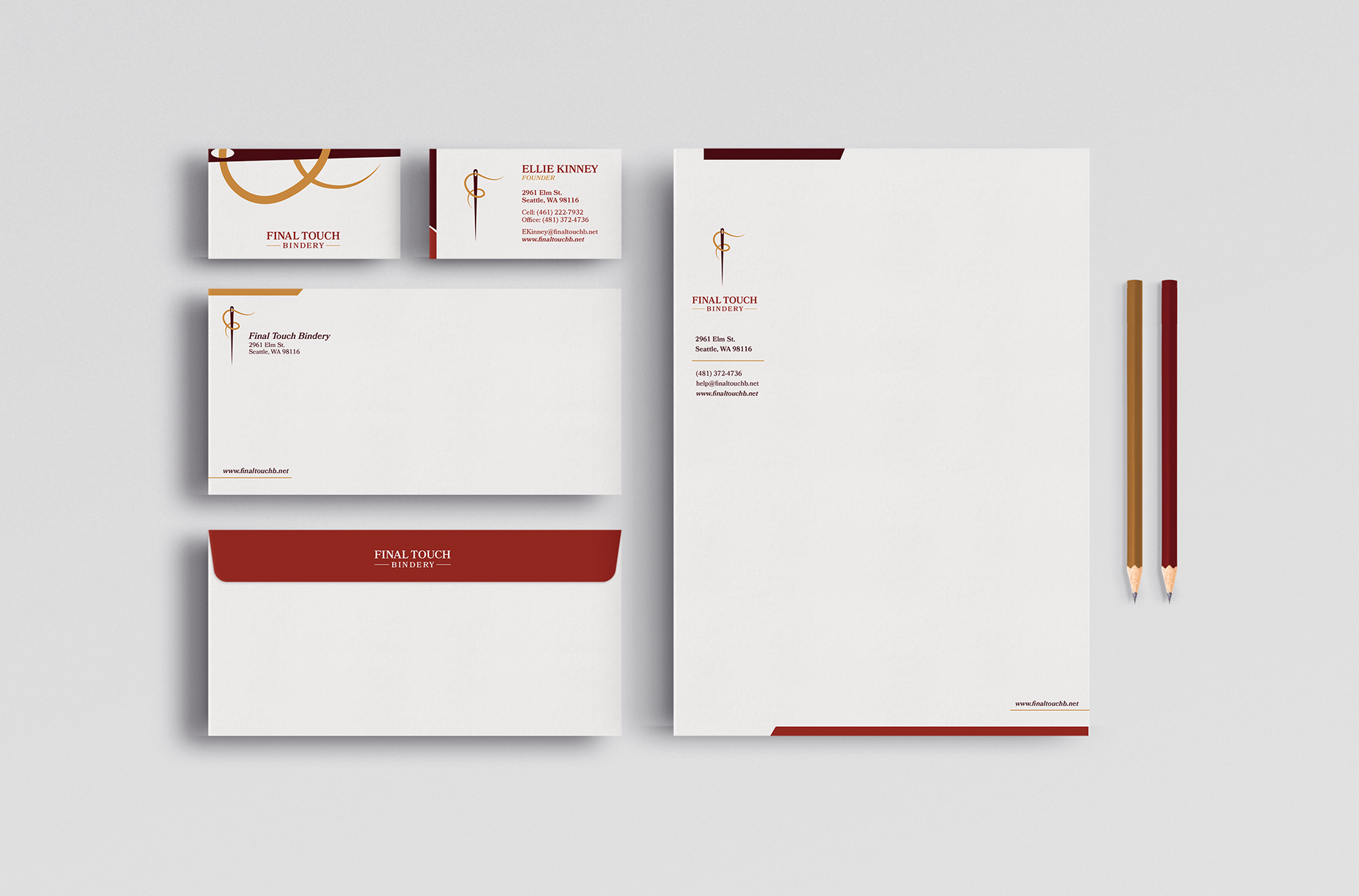
A lettermark created for a bookbinding company called "Final Touch Bindery". Due to the intricacy and intimacy when binding books, I decided to use a needle and thread to form the "F".
I chose gold for the thread to symbolize the value that bookbinding holds.
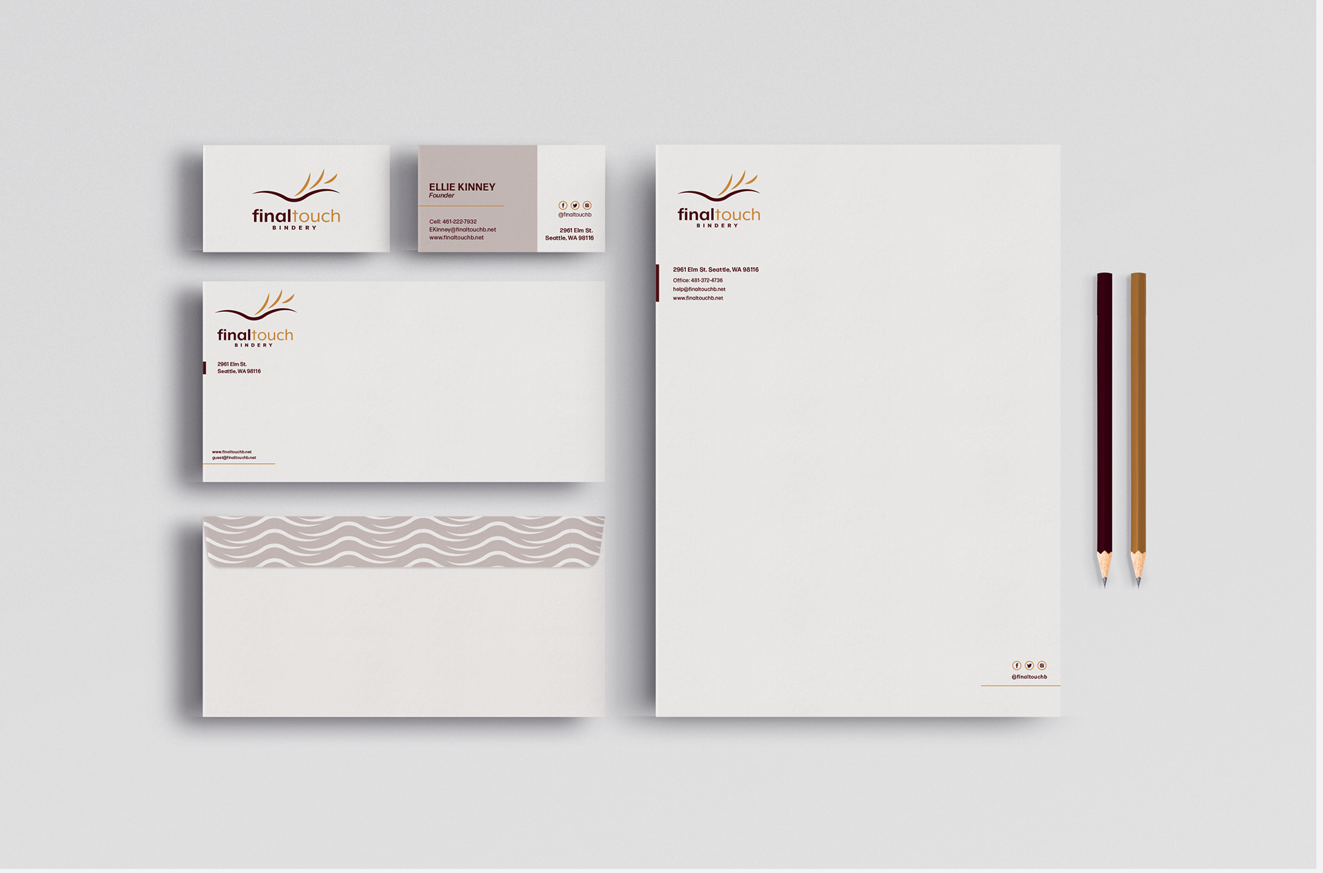
Secondary logo that is reminiscent of a book with the pages flipping in the air. It is a more whimsical and playful approach compared to the lettermark above.

A second set of a stationery with a representational logo.
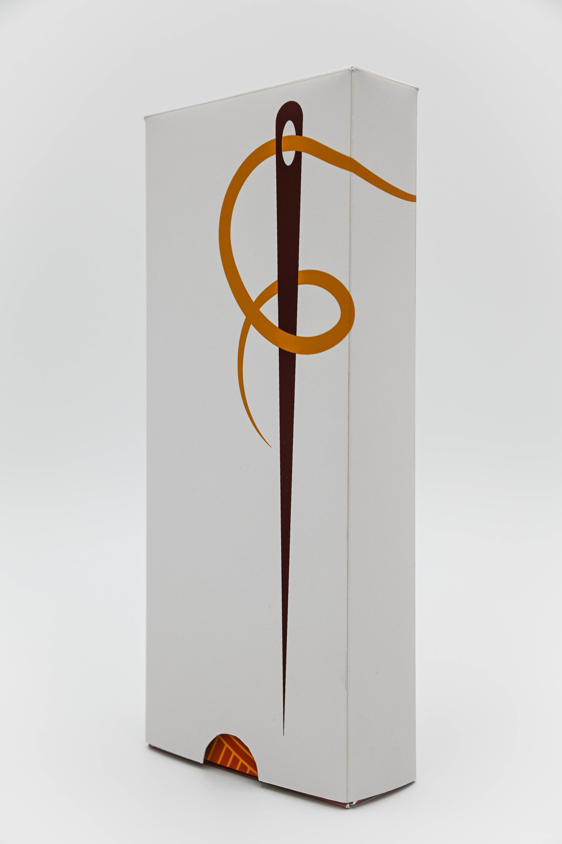
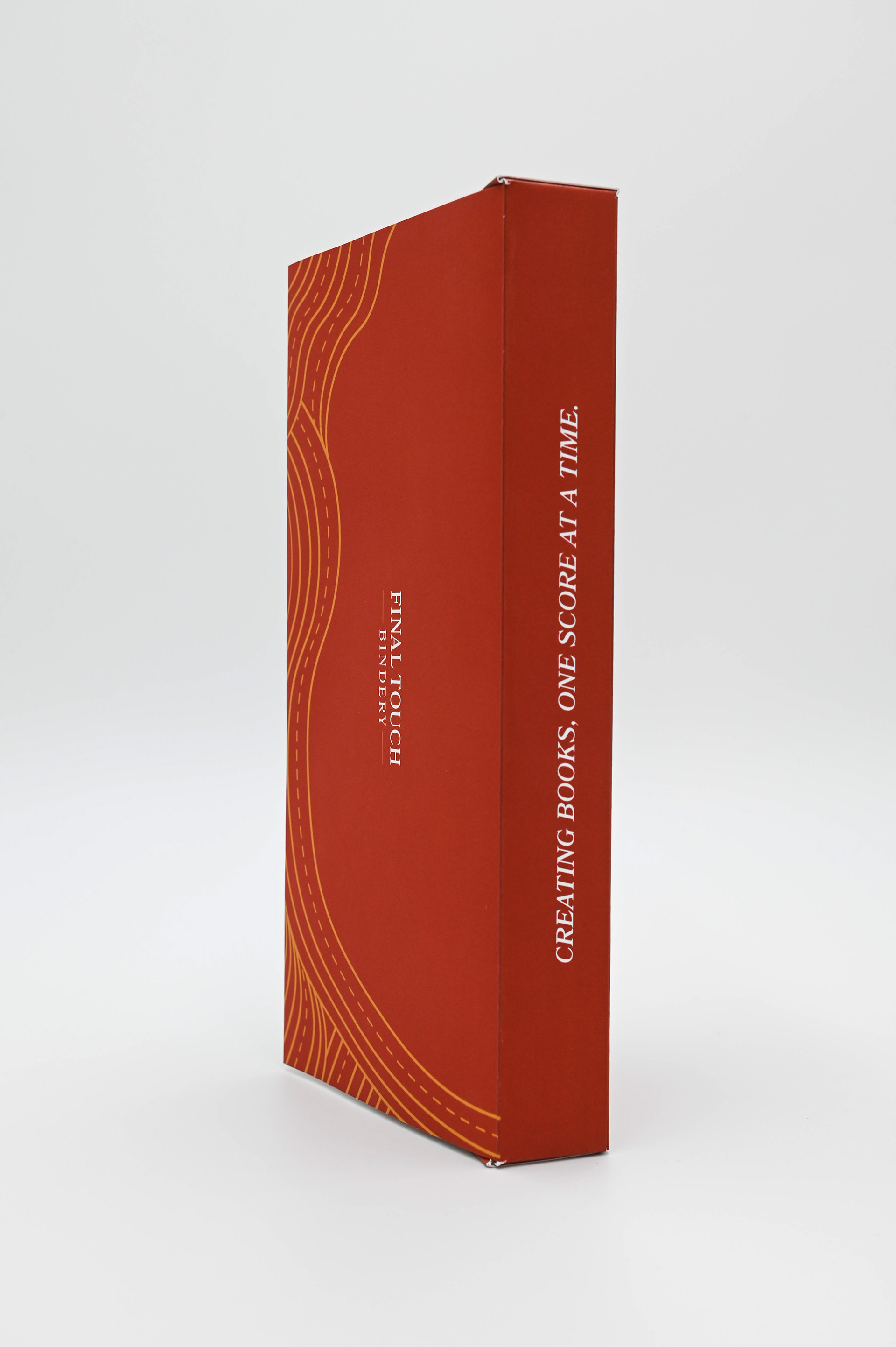
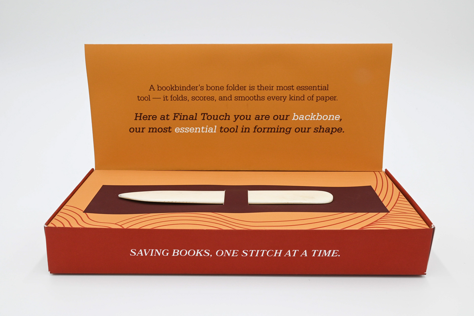
A client-self promotion package design for Final Touch Bindery. This box is mailed out to clients and is used to advertise Final Touch's company and services. A bone folder is presented in the box, because of its versatility, it is known as a bookbinder's most useful and important tool. Connecting to that, on the inside it is stated that the client is Final Touch's most important asset. Allowing the company to move forth and succeed.
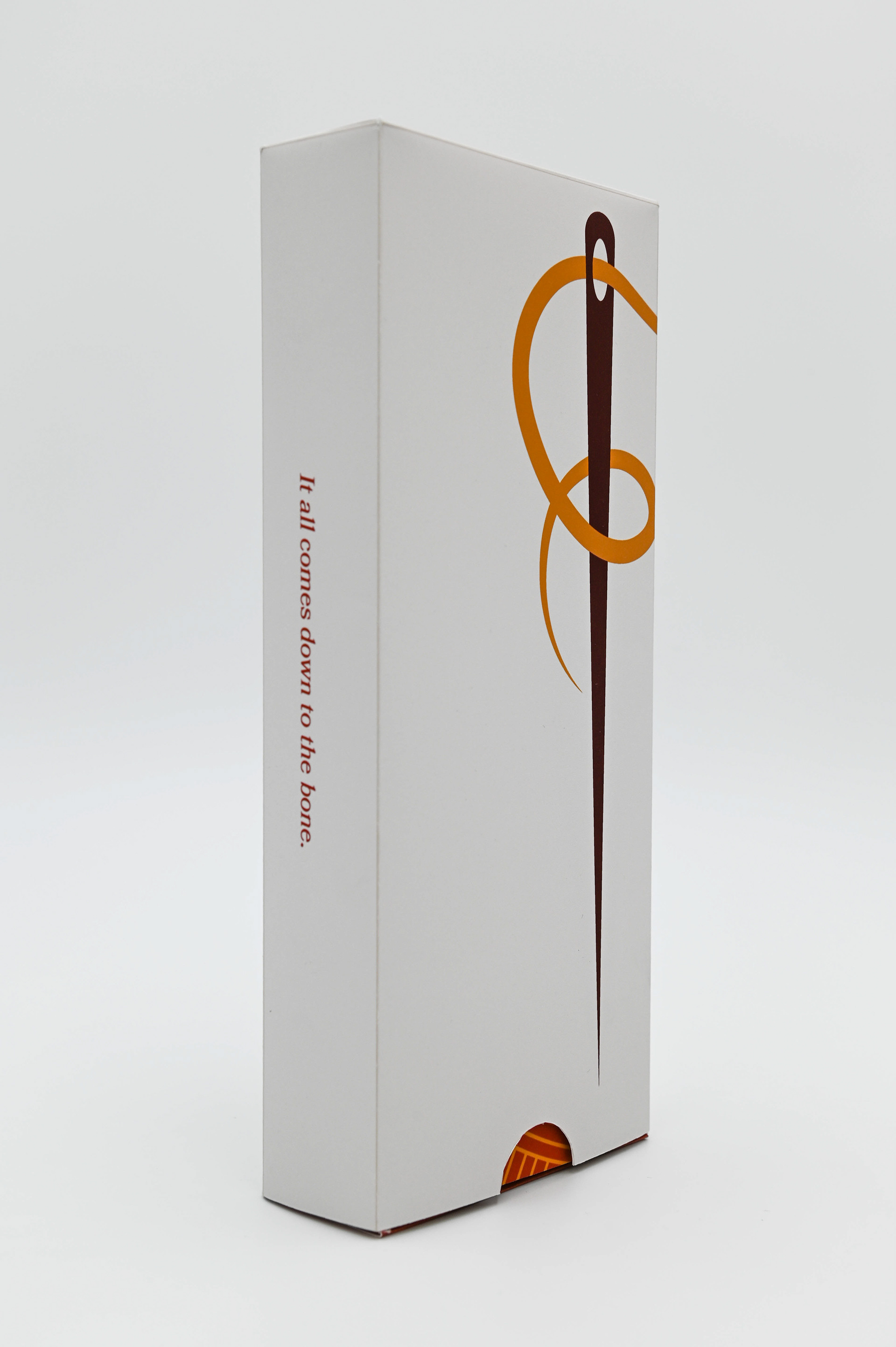
Outside of the box has an enlarged lettermark logo that wraps around the box and a saying on the spine. These two elements are used to keep the inside a mystery, but not completely a surprise.
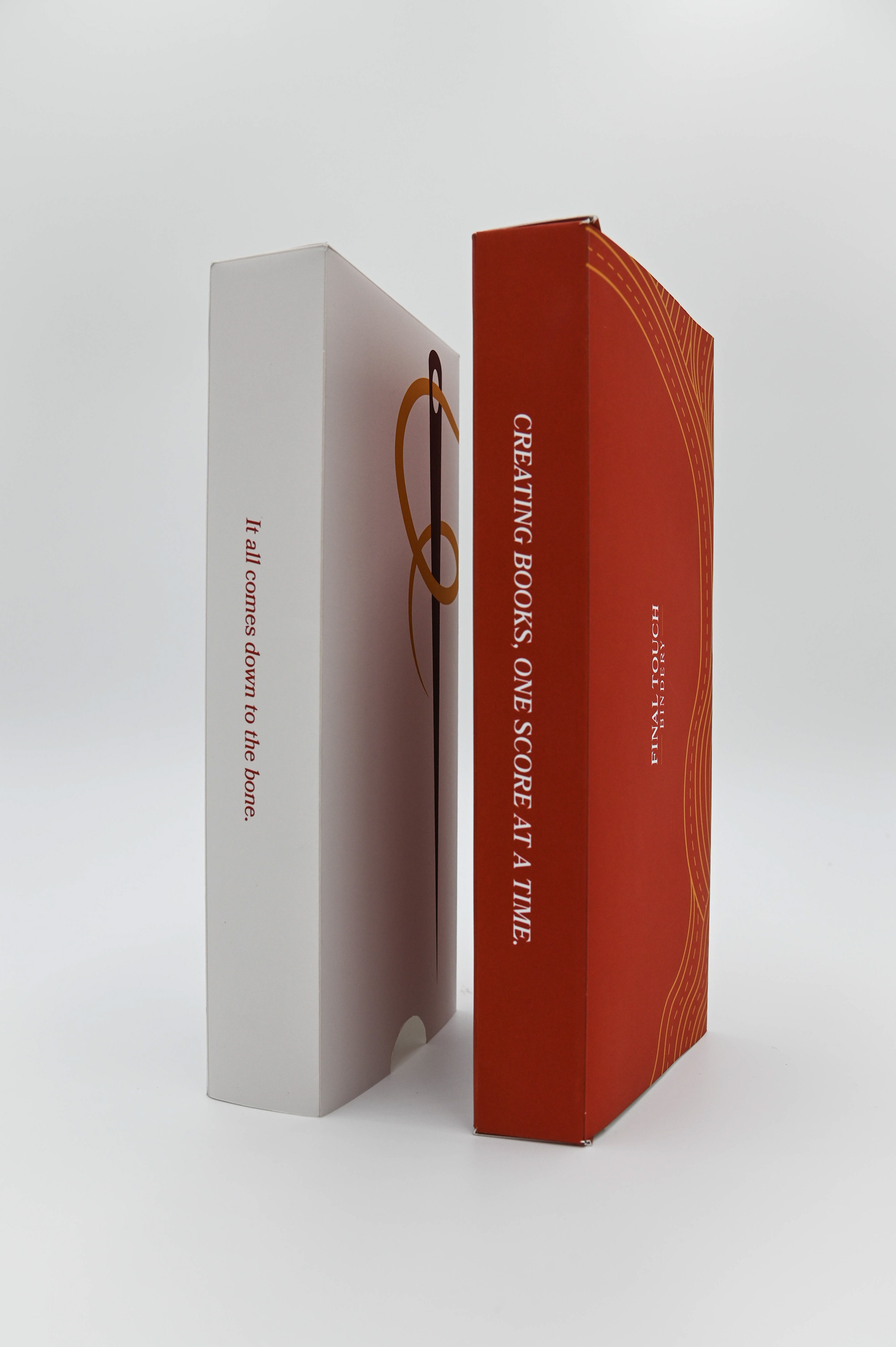
Details of the inside box and outside sleeve together.
On the spine lay sayings to inform about the services that Final Touch provides.
Details of the inside including the copy and bone folder.
Details of the bottom of the inside box, including full logo and contact information.
